The Badge Board — a proposal to react to
You asked for a redesigned certificate with new badge artwork. This goes one step further than that, and I want your permission before it goes anywhere near the course. The idea is simple: stop making the certificate the thing you get at the end, and make it the thing you get on day one.
Why it is worth doing. A certificate at the end rewards a child who already finished. A board on the fridge from day one works on the child who has not. Four empty slots staring at them for a week is the strongest completion device we have, it costs nothing, and it makes the badge artwork matter because the reward is visible the whole way.
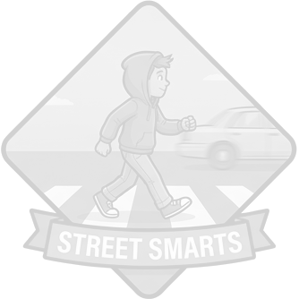
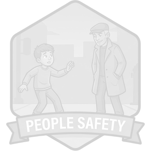
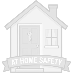
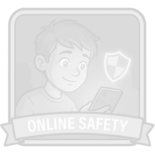
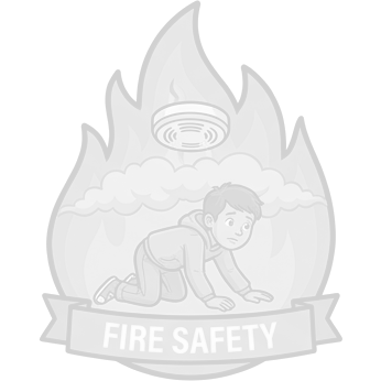
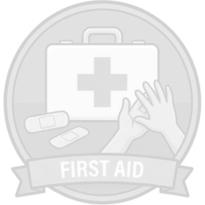
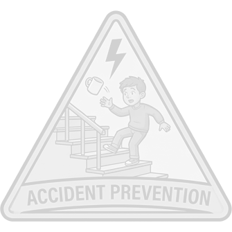
Day one. Printed the day they start. Goes on the fridge.
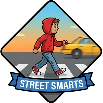
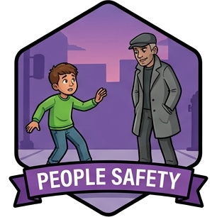
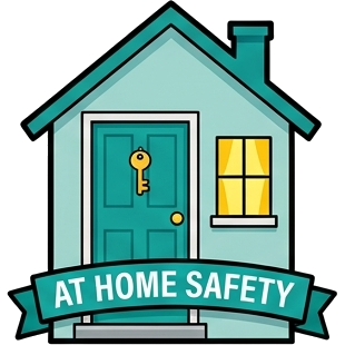
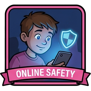
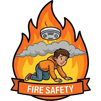
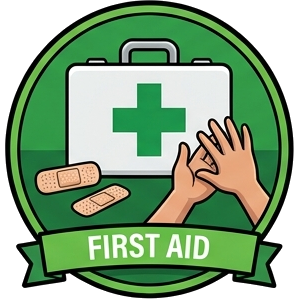
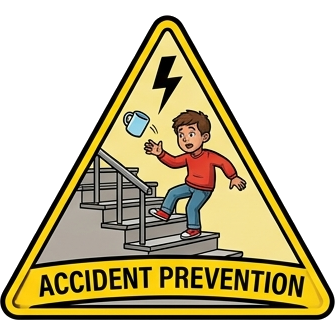
Finished. Same sheet. The strip at the foot is now the certificate.
The badge artwork
Seven distinct shapes, seven distinct colour worlds, and every badge is a small illustrated scene with a child in it rather than a symbol on a coloured field. They are designed to survive being shrunk to the size of a progress dot in the course and blown up to the size of a sticker on a backpack.
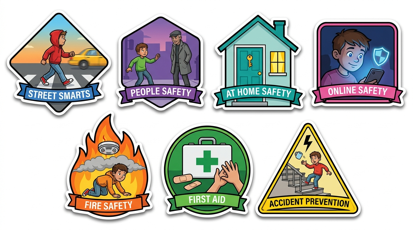
Every First Aid mark is a green cross, per your instruction — and that is now a standing rule across everything, not a one-off fix.
Fire Safety shows a child inside the flames. People Safety shows a stranger drawn as a shadowy figure in a long coat and hat. Both are fear images, and your course does not teach fear — it teaches check first with an adult in charge, and it teaches a calm escape. A child in peril and a sinister stranger contradict the thing the lesson actually says. I would redraw both: Fire Safety as a child already low and moving out toward a door with the alarm sounding, People Safety as a child confidently stepping back and asking a known adult. Tell me if you agree and I will reshoot those two.
1. Is the badge board idea a yes or a no? It changes the certificate from a document into a device, and that is your call, not mine.
2. The original certificate artwork. You offered it — please send it. Even with a new idea on the table I want to see what I am departing from.
3. The brand typeface, if one exists. Everything here is set in a system font, which is fine on screen and not fine on a sheet a child prints and keeps.
4. Fire Safety and People Safety — agree they need redrawing?
If the board is a no, that is a perfectly good answer and the two straightforward certificate layouts are still on the table. Nothing here is in the course, and nothing goes in until you say so.